

The Map Itself: What Piri Reis Actually Created
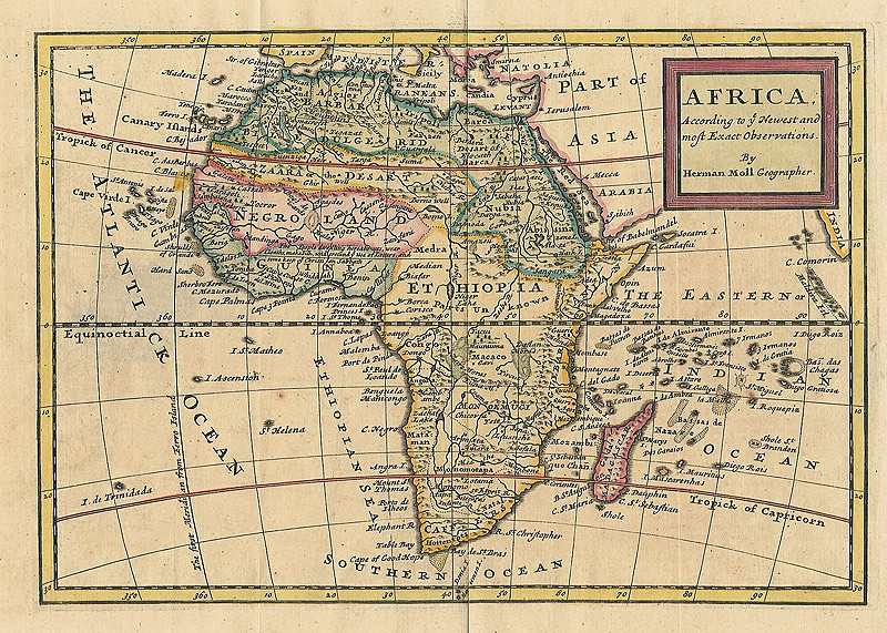
The Piri Reis map remains one of the most debated cartographic documents of the early modern era. Created in 1513 by the Ottoman admiral and cartographer Piri Reis, the map was drawn on gazelle skin and compiled from multiple earlier sources. The surviving section measures approximately 87 by 63 centimeters and is not complete. The extant section represents roughly one-third of the original, which would probably have shown the entire world as known in the early sixteenth century. From what remains, portions of the Atlantic Ocean, Europe, Africa, and the Americas are visible.
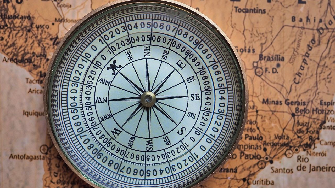
When rediscovered in 1929, the remaining fragment garnered international attention as it includes a partial copy of an otherwise lost map by Christopher Columbus. The map is a portolan chart with compass roses and a windrose network for navigation, rather than lines of longitude and latitude. For a map produced just 21 years after Columbus’s first voyage, the depiction of the South American coastline is remarkably detailed.
The Man Behind the Map: Piri Reis the Admiral
Much of Piri Reis’s biography is known only from his cartographic works, including his two world maps and the Kitab-ı Bahriye (Book of Maritime Matters) completed in 1521. He sailed with his uncle Kemal Reis as a Barbary pirate until Kemal Reis received an official position in the Ottoman Navy in 1495. In one naval battle, Piri Reis and his uncle captured a Spaniard who had participated in Columbus’s voyages, and who likely possessed an early map of the Americas that Piri Reis would use as a source.
The Piri Reis map was not merely a single drawing but a compilation of at least 20 different source maps. Among these, Piri Reis himself claimed to have used eight Ptolemaic maps, four Portuguese charts, and one “lost” map by Christopher Columbus. Rather than inventing geography from scratch, Piri Reis synthesized existing knowledge. His own marginal notes confirm that he relied on earlier charts, combining them into a single representation.
The Antarctica Claim: Where the Controversy Begins
In 1929, scholars at the Topkapı Palace in Istanbul discovered a fragment of a world map drawn on gazelle skin and dated to 1513, and this map immediately attracted attention because it showed the Atlantic Ocean with surprising accuracy including the coastlines of South America and Africa positioned correctly relative to each other at a time when European world maps were still crude and often wildly inaccurate, but the truly mysterious aspect emerged when researchers noticed that the southern portion of the map appeared to show a coastline that matched the northern coast of Antarctica, a continent that would not be officially discovered until 1820.
The most controversial feature of the map lies in its southernmost landmass. In the 20th century, historian Charles Hapgood proposed that this portion might represent Antarctica, specifically Queen Maud Land, allegedly shown without its ice cover. If true, that would imply access to geographical knowledge thousands of years older than officially recognized Antarctic exploration, which began in 1820. The great debate was sparked by Professor Charles Hapgood when he published his theory on the Piri Reis map in his book “Maps of the Ancient Sea Kings” in 1965. He and a team of students at the University of New Hampshire studied the map and found many anomalies, such as the use of mercatorial projection and the inclusion of a pre-ice Antarctica.
The Hapgood Hypothesis: Genius or Overreach?
Professor Hapgood and his students theorized that the Piri Reis map had to have been based on information older than 4,000 BCE. This is long before any known sophisticated civilizations or any well-defined languages, and the map introduces the theory of an ancient civilization that had the skills to navigate the world’s oceans and accurately chart the lands they visited. Hapgood’s book was met with skepticism due to its lack of evidence and reliance on polar shift. Hapgood acknowledged that his theory disregarded the text and some of the placement of land masses on the map.
According to geologist Paul Heinrich, this approach mistakenly conflates the topography of Antarctica below the ice with a hypothetical ice-free Antarctica. It does not take into account post-glacial rebound, where land rises after massive ice sheets melt away. Additionally, the 1949 survey that Hapgood relied upon could not measure even one percent of the area drawn in the Piri Reis map. Subsequent studies with access to more data have shown no significant similarities to Antarctica’s coast beneath the ice or a projected Antarctic coastline without ice.
What Ice Core Science Actually Tells Us

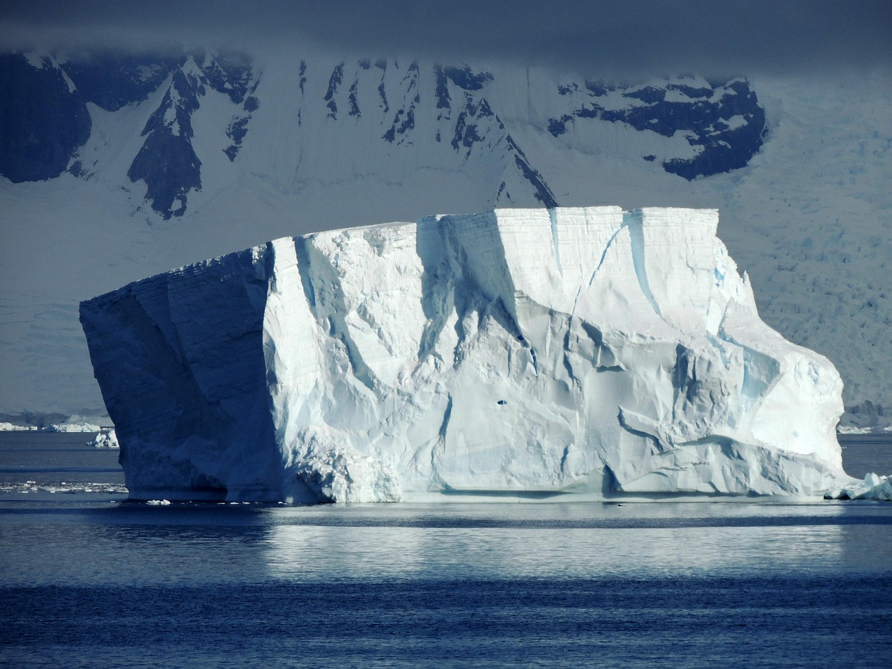
Hapgood mistakenly believed that Antarctica had been free of ice in 17,000 BC and partially ice-free as late as 4,000 BC. This erroneous date range could have put the mapping of Antarctica contemporary with many known prehistoric societies. More recent ice core data shows that Antarctica was last free of ice over ten million years ago. This single scientific finding is perhaps the most damaging blow to the entire ancient-mapping theory.
There is evidence that Antarctica has hosted at least some ice for 30 million years. A Europe-wide scientific collaboration has unveiled the longest continuous record of Earth’s climate and atmospheric conditions, stretching back 1.2 million years. The data were extracted from a 2.8-kilometre-deep ice core drilled in Antarctica, and show how the concentration of carbon dioxide in the atmosphere tracked the changes in global temperatures across several cycles of climate change. The paleoclimate picture is unambiguous: Antarctica as a warm, mappable, ice-free continent in human prehistory has no scientific support.
The Terra Australis Explanation

The southern continent stretching across the map is most likely Terra Australis. Some authors have claimed that it depicts areas not officially discovered in 1513, but a popular hypothesis identifying it as Antarctica has been disproven. Maps of the period generally depicted this theoretical southern continent in various configurations. This land was originally posited by Roman geographer Ptolemy as a counterbalance to the extensive land areas in the known world.
One explanation is that the anomalous continent is actually Terra Australis Incognita, a continent hypothesized to exist there. Many contemporary maps are filled with mythical territories that were assumed to exist in reality. These include the Garden of Eden, El Dorado, and the lands of Prester John. Some cartographers of the time speculated or extrapolated landmasses based on limited data, sometimes filling in gaps with educated guesses. The Piri Reis 1513 map used multiple sources, and it is conceivable that at least one of those sources contained speculative geography.
The Cartometric Arguments: What Modern Analysis Shows
Recent studies using cartometric analysis, a method of comparing historical maps against modern satellite coordinates, have revealed intriguing findings. Researchers such as M. Marelić and B. Šlaus have argued that the portolan charts, which include the Piri Reis map, were constructed as a “mosaic” of smaller, highly accurate regional surveys. These individual tiles of the map show a geometric precision that is nearly twice as high as the overall composite. This suggests that Piri Reis was working with source maps that were surveyed with sophisticated instruments, possibly involving early forms of trigonometry that were not widely documented in 1513.
Piri Reis used a technique called portolan projection, showing compass directions and sailing distances with remarkable accuracy. According to cartographic experts, the map’s calculations along the African coastline are precise to within 50 miles, a remarkable feat for a map of its time. The Piri Reis map is not a modern coordinate-based projection. It functions as a portolan-style chart, focused on relative distances and navigational bearings rather than precise global grids. When modern researchers overlay the map onto contemporary projections, adjustments and reinterpretations are required to achieve alignment. That suggests skilled approximation, not lost geodetic technology.
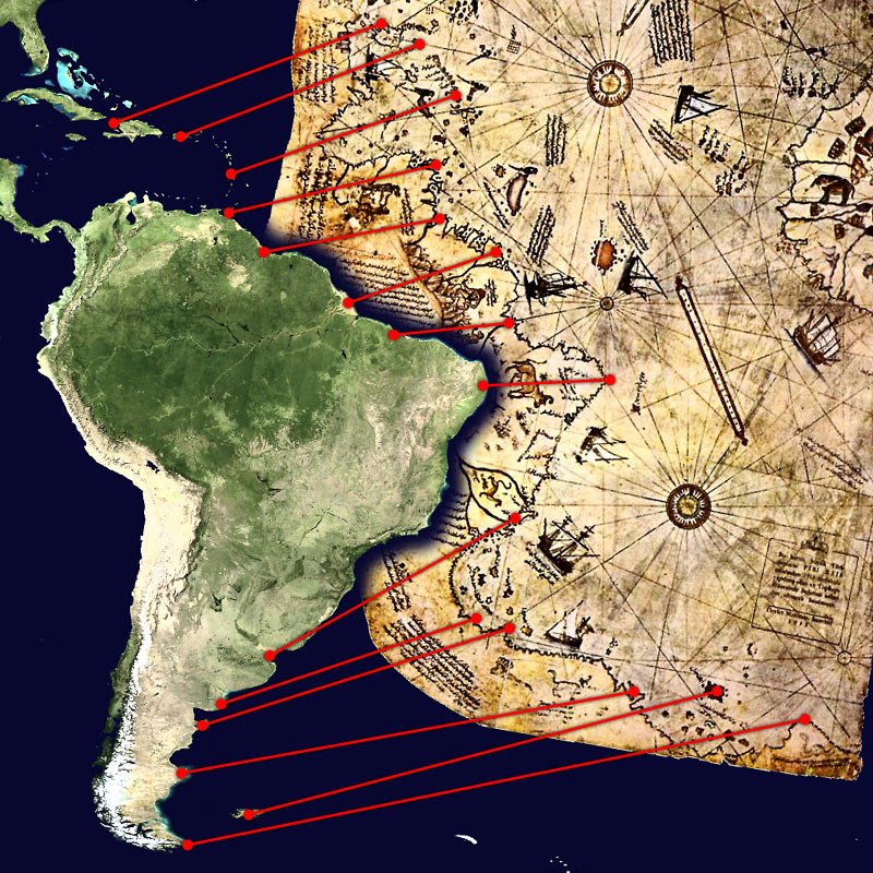
The South American Coastline Argument

If the land depicted at the bottom edge of the map is really Antarctica, one may ask why none of those who support this theory explains what has become of the missing 1,200 miles of coast from Brazil to Tierra del Fuego, the whole length of Argentina. One need only examine that part of the map carefully to realize, even without being an expert cartographer, that it represents nothing more than the extremity of the South American continent, an approximate representation made possible by means available at that time. The drawing is deformed and slanted, possibly to conform to the peculiar shape of the piece of parchment.
While some theorists, including Charles Hapgood, argued the map shows the sub-glacial coast of Antarctica, most modern scholars believe the lower portion is a distorted representation of the South American coastline, possibly intended to represent the Terra Australis Incognita common in Renaissance geography. Jason Colavito has pointed out that “as scholars have known for decades, the segment of the map identified by Hapgood as ‘Antarctica’ was in fact the southern part of South America, bent to fit the shape of the skin on which it was drawn.”
The Buache Map and the Broader Pattern of Anomalous Charts

French geographer Philippe Buache published a map of what some consider an ice-free Antarctica in 1737, long before its recorded discovery and centuries before seismic surveys revealed the topography of the sub-glacial landmass. The source of the data for this map is so far unexplained, according to some researchers. Yet the academic assessment of that map is equally skeptical. Buache’s map bears no relation to the reality of the continent’s sub-glacial topography, and his mapping of Antarctica is rather based solely on scientific speculation, which his own published article explains in considerable detail.
Buache’s own annotations are very honest: he never claims the map is accurate, even writing “Conjecture” on some of the features. These annotations are consistently overlooked in works attempting to prove the existence of ancient civilisations, but for anyone interested in European history they are fascinating. They document the concerted effort European sailors were making to explore and map the Antarctic regions in the 1730s. The Buache map, like the Piri Reis map, turns out to be far more explicable when read in the actual language it was written in.
Where the Science and the Mystery Stand Today
Over the years, modern cartographers and historians have examined the Piri Reis map using satellite data and computer modelling. Some studies suggest that parts of the map, particularly its representation of South America, are surprisingly accurate when adjusted for projection methods. However, most academic consensus agrees that the map does not show Antarctica, at least not with the precision or intent that some claim. Instead, it is a mix of observation, second-hand reports, and artistic license.
Geophysicists add that paleoclimate data rules out an ice-free Antarctica in recent prehistory, rejecting Hapgood’s crustal displacement theory. The fundamental mystery of the Piri Reis map is not whether it definitively proves ancient mapping of Antarctica, which remains highly controversial and disputed by mainstream scholars, but rather how a 1513 map could show such accurate longitude measurements and coastal details for regions that European explorers had only recently begun to discover. The early 1500s were a period of intense information exchange. Portuguese explorers were mapping the African coast and the South Atlantic. Spanish expeditions were charting the Caribbean and parts of Central and South America. Trade routes connected Europe, North Africa, and the Ottoman world. Maps were copied, traded, modified, and merged. Knowledge moved across empires faster than we often assume. The Piri Reis map reflects this interconnected environment.
Conclusion: A Map Worth Taking Seriously, for the Right Reasons

The Piri Reis map does not need a lost civilization to be extraordinary. Piri Reis was not the only Ottoman cartographer to produce documents that seem ahead of their time. The Hajji Ahmed map of 1559, a heart-shaped world map, also shows a level of geographic knowledge that seems advanced. Most notably, it appears to show a land bridge between Siberia and Alaska, the Bering Strait, long before it was officially discovered by Vitus Bering in 1728. When viewed alongside the Piri Reis map, a pattern emerges: the Ottoman Empire was a central clearinghouse for a global intelligence network of geographic data that has since been largely lost to the West.
The core holds firm: Piri Reis crafted a remarkable 1513 chart from diverse, now-lost sources. Scholarship leans toward everyday cartographic quirks explaining the oddities, not ancient secrets. The genuine wonder of the map lies in what it actually proves: that in 1513, one Ottoman admiral synthesized the world’s best available geographic knowledge into a single document with impressive accuracy. That is, on its own terms, an astonishing human achievement. The paradox dissolves when we stop looking for a lost civilization and start looking more carefully at the civilization that was already there.