
Imperfect Beauty in Every Stroke (Image Credits: Unsplash)
Typography continues to evolve as designers seek fonts that convey authenticity amid digital perfection. Fast Company showcased PP Kyoto in its “It’s All in the Typeface” series, spotlighting the slab serif selected by creative director Mike Schnaidt for the Spring 2026 issue. This typeface merges the fluid grace of Japanese calligraphy with robust Latin slab forms, delivering a handmade warmth that enhances every layout it graces.[1][2]
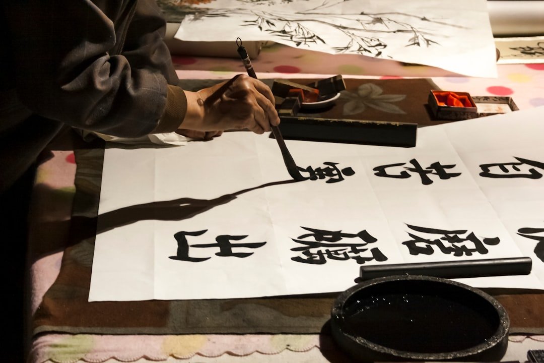
Imperfect Beauty in Every Stroke
Digital typefaces often prioritize precision, but PP Kyoto thrives on subtle imperfections that mimic traditional ink work. Its bold slab serifs pair with soft teardrop terminals, creating the illusion of ink bleeding at the edges – a deliberate choice that infuses text with organic energy.[2] Prominent dots add rhythmic punctuation, turning headlines into dynamic compositions rather than static lines.
This expressive character emerged from years of refinement. Designers at Pangram Pangram Foundry explored Japanese writing systems, drawing inspiration from the calligraphic flow of hiragana and katakana. The result stands as a bridge between cultural legacies and contemporary needs, suitable for global projects.[2]
Cultural Roots Shape Modern Versatility
PP Kyoto originated as a conceptual study of how slab serifs could harmonize with East Asian scripts. The foundry evolved it through persistent iteration, balancing solid structures with soulful details. This process yielded a font that supports bilingual typography seamlessly, accommodating full Latin character sets alongside hiragana, katakana, and Japanese punctuation.
Key design elements contribute to its cross-cultural appeal:
- Teardrop terminals for a calligraphic softness.
- Bold slabs that ensure readability at large sizes.
- Stylistic alternates, including refined Q and alternate $ glyphs.
- Standard ligatures like fi, ff, and ffl for polished flow.
- Old-style figures for nuanced numerical display.
Such features make it ideal for international branding and editorial work, where visual impact meets technical reliability.[2]
Technical Depth for Professional Use
Pangram Pangram engineered PP Kyoto with 18 static styles plus variable options, spanning Thin (100) to Heavy (900) weights, each with matching italics. This extensive family allows precise control over hierarchy in layouts, from delicate body text accents to commanding display elements. Formats include OTF, TTF, WOFF, and WOFF2, ensuring compatibility across web and print.[3]
The following table outlines the core weight spectrum:
| Weight | Style | Numeric Value |
|---|---|---|
| Thin | Regular & Italic | 100 |
| Extralight | Regular & Italic | 200 |
| Regular | Regular & Italic | 400 |
| Bold | Regular & Italic | 700 |
| Heavy | Regular & Italic | 900 |
With 692 glyphs per style, it covers languages from Afrikaans to Turkish, plus extensive Japanese support. Designers can try it free on the foundry’s site before committing to a license.[2]
Fast Company’s Editorial Endorsement
Mike Schnaidt praised PP Kyoto’s human feel when announcing its role in Fast Company’s Spring 2026 issue. The typeface’s exploratory origins aligned with the publication’s innovative spirit, reflecting a hands-on approach to every page. This selection underscores a broader trend: fonts that prioritize emotional resonance over sterile perfection.[1]
Read more in Fast Company’s feature on the typeface. Explore and download trials at Pangram Pangram.[2]
Key Takeaways
- PP Kyoto’s teardrop serifs evoke ink bleed for authentic texture.
- 18 styles plus variables support diverse applications.
- Japanese-inspired design excels in multilingual editorial work.
PP Kyoto proves that typography’s future lies in blending heritage with innovation, offering designers a tool that feels alive on the page. As publications like Fast Company embrace such voices, the line between digital and artisanal blurs further. What do you think about this typeface’s potential? Tell us in the comments.