


The Dot That Isn’t Braille
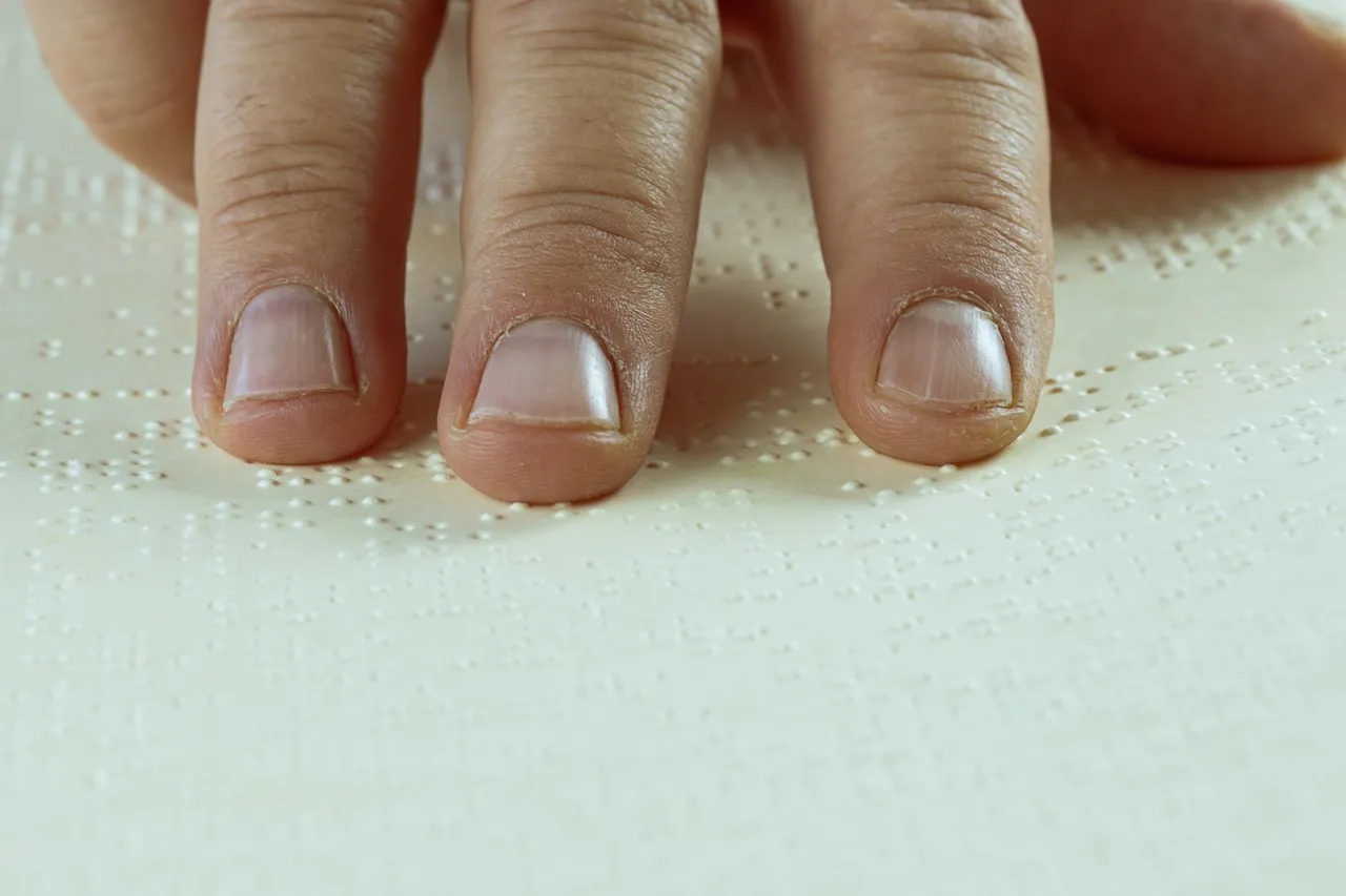
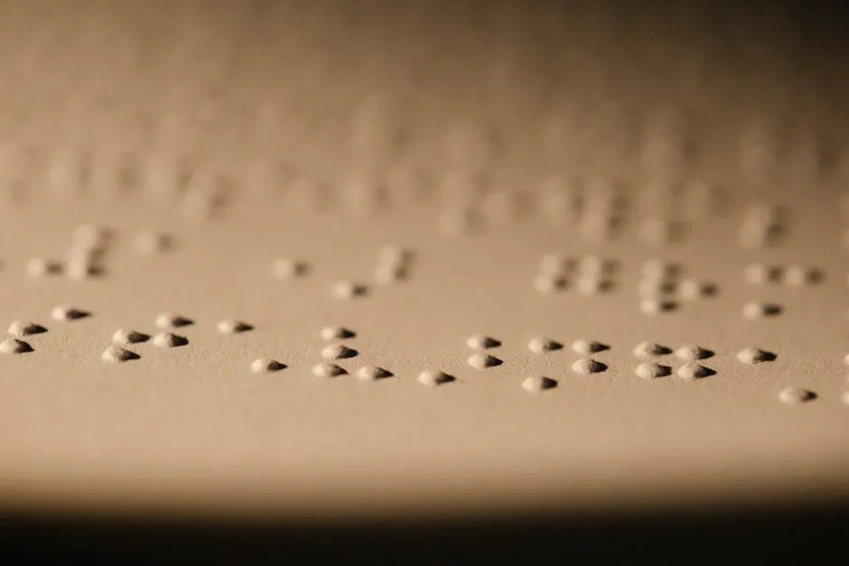
When people first notice the raised dot on an elevator keypad’s number five, the immediate assumption is that it must be Braille. Braille, however, uses a specific grid of up to six dots arranged in pairs to represent letters and numbers. A single isolated dot on a button doesn’t represent any Braille character on its own.
The dot serves a different, more direct purpose: spatial orientation. It’s a tactile anchor point. Most blind users are able to operate a keypad because they can detect the key five due to the raised dot in that key. From that single reference point, a person can count outward in any direction to find any other number on the panel.
It Follows the Same Logic as a Phone Keypad
The raised dot on the number five didn’t originate in elevators. It came from the telephone keypad, which became a widely standardized layout in the mid-twentieth century. An accessible telephone keypad carries tactile markings including a raised dot on the five key, and the building blocks for this design were laid by John E. Karlin and his team at Bell Labs.
The logic is similar to the small raised bars on the F and J keys of a computer keyboard. Those bumps tell touch typists where their index fingers belong without looking down. Labels appear directly on key surfaces, often in raised or embossed form for tactile feedback, enhancing usability in diverse environments. The number five dot works the same way: it’s a home position for the fingertip.
What the ADA Actually Requires

In the United States, the specific requirement for this dot is written directly into federal law. The number five key on elevator keypads must have a single raised dot, and that dot must be between 0.118 inch and 0.120 inch in base diameter. That’s a very precise specification, leaving almost no room for variation.
Under the ADA Standards for Accessible Design, section 407, buildings with elevators are required to post compliant elevator signage at each elevator shaft entrance, and these signs must include raised characters, Grade 2 Braille, and meet precise mounting, sizing, and contrast specifications. The raised dot on the five key is just one part of a much larger accessibility framework that governs the entire panel.
Braille Is Separate, and Placed Elsewhere
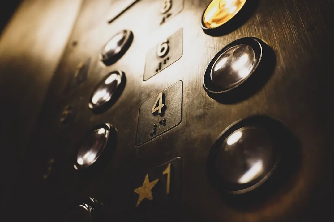
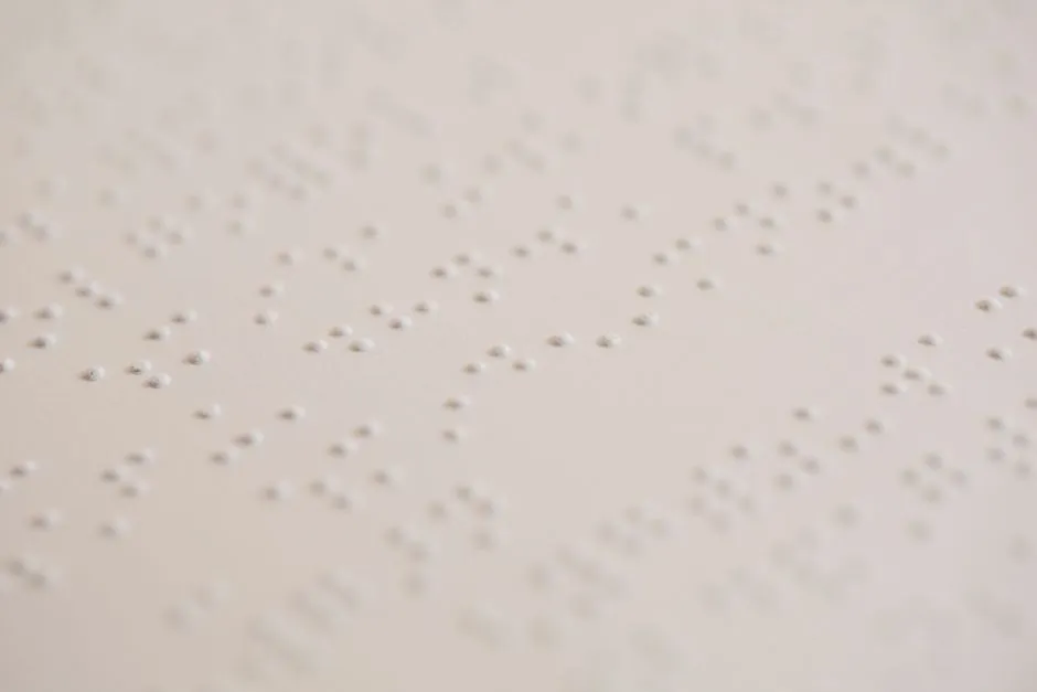
It’s worth being clear about one thing: real Braille is absolutely required on elevator control panels, but it is positioned separately from the buttons themselves. Raised character and Braille designations must be placed immediately to the left of the control button to which they apply. So the Braille label sits beside the button, not on top of it.
Braille provided on elevator car controls must be separated by at least 3/16 inch and must be located either directly below or adjacent to the corresponding raised characters or symbols. This separation matters because cramming Braille onto the button face itself would make both the tactile number and the Braille character harder to read by touch.
The Scale of the Need
Some may wonder if all this specificity is really necessary. The numbers tell a clear story. Approximately 2.2 billion people live with visual impairment globally, including one billion with blindness or moderate to severe visual impairment. That’s not a niche population. It’s a significant portion of humanity that moves through buildings every single day.
More than a quarter of the world’s population has some form of vision impairment according to the World Health Organization, and in the United States, vision disability currently ranks as one of the top ten disabilities among adults per the Centers for Disease Control. Designing elevator panels for this reality isn’t a courtesy. It’s basic functional necessity.
Emergency Controls Have Tactile Rules Too
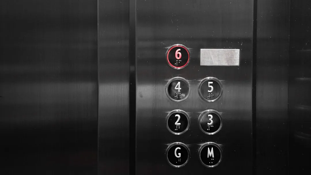
The raised dot on the five is probably the most noticed tactile feature on an elevator panel, but it’s far from the only one. The control buttons for the emergency stop, alarm, door open, door close, main entry floor, and phone must all be identified with specific tactile symbols. Each function has its own standardized shape requirement so that a visually impaired person can identify it purely by feel.
The control buttons for the emergency stop, alarm, door open, door close, main entry floor, and phone must be identified with tactile symbols as specified in ADA Table 407.4.7.1.3. In a genuine emergency, a person who cannot see must be able to locate the alarm button without hesitation. These tactile conventions make that possible.
A Shared Standard Across Many Devices
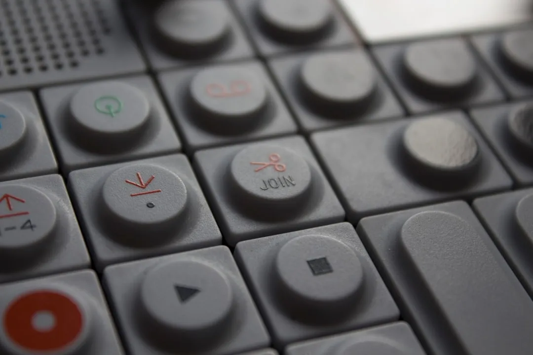
The raised dot on the number five has migrated well beyond elevators and phones. ATMs, building security keypads, and point-of-sale terminals increasingly share the same convention. The Department of Justice Standards for Talking ATMs require that numeric keys be arranged in a 12-key ascending or descending telephone keypad layout. Consistency across devices is part of what makes the tactile anchor actually useful.
In real workplace settings, accessibility staff have marked security system keypads with a bump dot on the number five so that all staff members can access the system. That example is telling: the dot doesn’t just help blind users. It helps anyone navigating a panel in low light, high stress, or with their hands full. The benefit is genuinely universal.
Universal Design, Not Just Disability Design
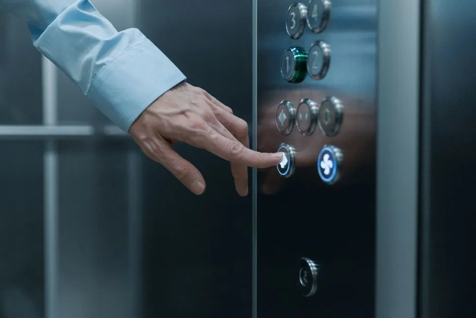
There’s a broader principle worth understanding here. Universal design refers to building environments and objects that work for the widest possible range of people, not just those with specific disabilities. The raised dot on a keypad is a textbook example. It costs almost nothing to include, and it improves the experience for sighted users in dark or unfamiliar situations just as much as it does for people who rely on touch entirely.
Many elevator control panels incorporate Braille and raised characters as an integral aspect of inclusive design, so that visually impaired visitors can independently find their way around. The key insight in universal design is that accessibility features rarely hurt anyone. They quietly help everyone.
The Strict Dimensions Behind a Seemingly Simple Dot
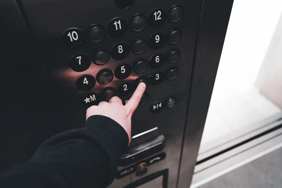
The precision of the specification is worth pausing on for a moment. A diameter range of 0.118 to 0.120 of an inch is a tolerance of just 0.002 of an inch. That’s not the kind of detail you find in casual design. It reflects the fact that tactile readability has been studied carefully and that the dot has to be large enough to feel but not so large that it obscures the number beneath it.
The law requires raised and Brailled characters and pictorial symbol signs, specifying that letters and numerals must be raised 1/32 inch, in upper case sans serif or simple serif type, and accompanied by Grade 2 Braille. Every dimension on an accessible elevator panel is the result of research and regulation working together, not just aesthetic instinct.
Why Accessibility Gaps Still Exist
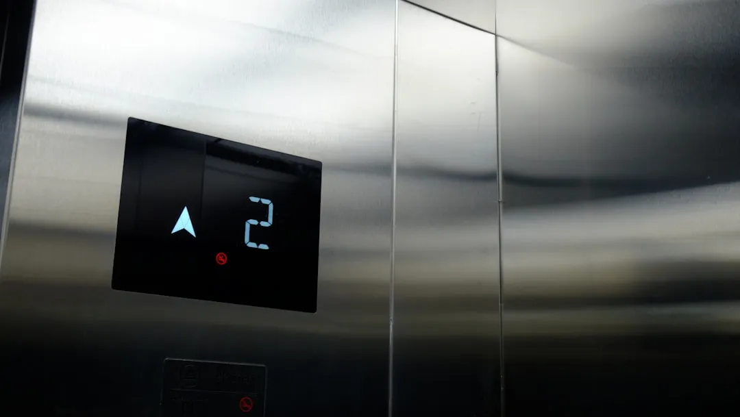
Despite clear federal requirements in the U.S. and similar standards in other countries, tactile accessibility in public spaces remains uneven globally. Only about ten percent of public transport systems worldwide are designed with visual impairment in mind, and roughly seventy percent of urban sidewalks lack tactile paving. Elevators in jurisdictions without strong enforcement often fall short of even the basics.
The ADA and other federal civil rights laws require that accessible features be maintained in working order, and building owners must note that the ASME Safety Code for Elevators requires routine maintenance and inspections. Failure to take prompt action to effect repairs could constitute a violation of federal law. The dot may be small, but keeping it in place and functional is a legal obligation, not an optional extra.
The Takeaway
That tiny dot is doing a lot of work. It’s a tactile home key, a navigation anchor, a legal requirement, and a quiet example of design that benefits far more people than its size suggests. The fact that it’s not Braille is actually the point: it doesn’t need to be. Its value lies in simplicity.
Good accessibility design rarely announces itself. It just quietly makes the environment a little more navigable for a lot more people. The raised dot on a five is one of the clearest illustrations of that principle in everyday life. Next time you’re in an elevator, you’ll probably feel for it without even thinking. That’s the mark of a design that actually works.
AI Disclaimer: This article was created with the assistance of AI tools and reviewed by a human editor.