

The Black Canvas: TikTok’s Dark Background Is Not Just Aesthetic
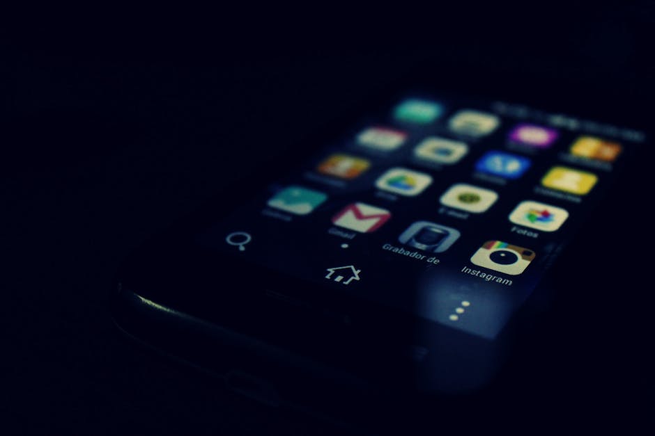
At first glance, TikTok’s near-black interface looks like a simple style choice, the kind of sleek, modern look that feels comfortable on a phone screen at night. The reality is more deliberate. TikTok highlights its action buttons with vibrant colors like red, strategically placed to stand out against the dark background of its interface.
This exploits Attentional Capture Theory: when a stimulus fills the entire visual field, the brain cannot help but attend to it. Instagram shows feeds with visible navigation, headers, and stories. YouTube shows thumbnails and sidebars. TikTok shows one video that owns one hundred percent of your visual attention.
For TikTok and many other social media apps, dark mode is the more popular option, and TikTok boasts about two thirds of its billion-strong user base using dark mode. The dark canvas doesn’t just look good. It removes every visual distraction except the content itself.
Red as a Trigger: The Most Calculated Color in the App
Dopamine colors like red, orange, and yellow stimulate the brain’s reward system, triggering pleasure and motivation. TikTok knows this. Its signature red heart, its notification indicators, its like buttons – none of this is chosen by accident.
Red can stimulate excitement and enhance performance on detail-oriented tasks by increasing dopamine release, while blue fosters calmness and trust, optimizing cognitive functions. The decision to use red for the most frequently touched elements in the app creates a subtle but persistent arousal state in the user.
Just as your brain lights up when you get a new like or swipe through a stream of engaging content, bright colors and bold shapes trigger the brain’s reward system. You see something exciting, and before you even process what’s happening, your brain is releasing dopamine. The red like button is not just a button. It is a reward signal.
The Slot Machine Palette: Variable Color and the Unpredictable Feed
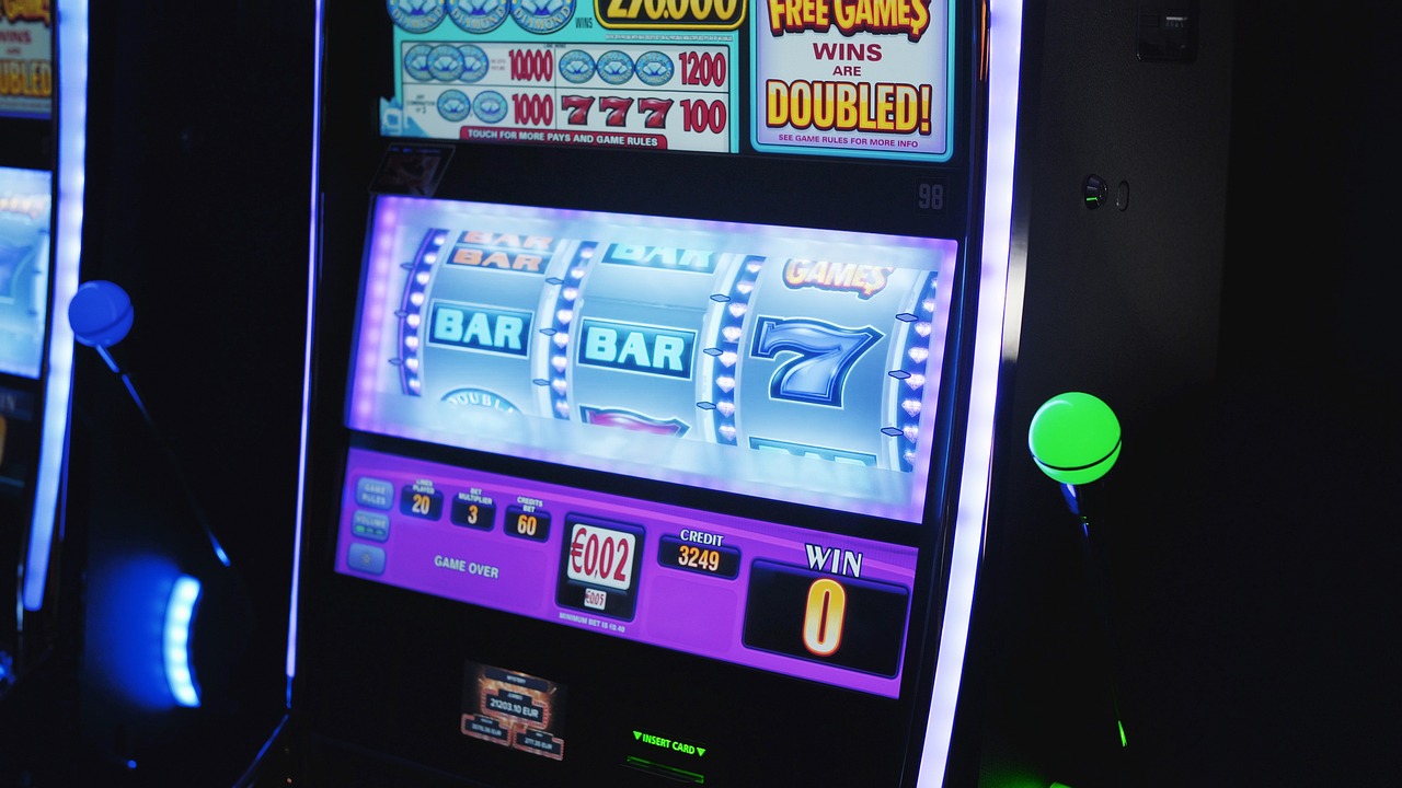
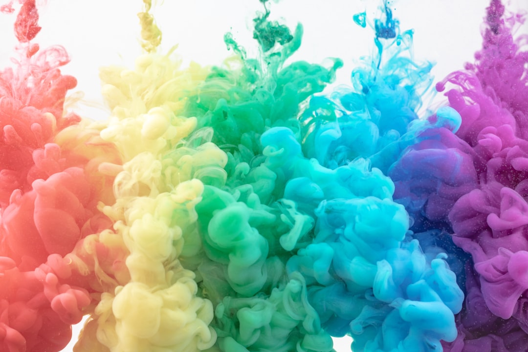
The effect is called variable reinforcement and is widely used in social media apps like TikTok, Reels, and Shorts. You’ll never know how many swipes it’ll take before you find something interesting. Every video brings a new visual environment, a new color scheme, a new emotional tone.
Psychologists call this a “variable reward schedule,” a system where the user receives unpredictable rewards at irregular intervals. It’s the same principle used in slot machines, where the uncertainty of winning triggers a powerful release of dopamine. The brain becomes wired to chase that next hit, even if the last one wasn’t very satisfying.
TikTok’s For You Page delivers rewards on a variable ratio schedule, the most addictive reinforcement pattern identified by B.F. Skinner. Not every video is amazing; some are mediocre, some are boring, and then suddenly one is perfect. This unpredictability is identical to slot machine psychology, where the brain releases more dopamine from intermittent, unpredictable rewards.
Full-Screen Immersion: How the Interface Erases Escape Routes
The app automatically puts users in full-screen mode, providing a more immersive experience. Moreover, users are not given many app functions to choose from, preventing analysis paralysis. The absence of clutter is not simplicity. It is containment.
The moment you open TikTok, a video is already playing. There’s no homepage to browse, no decisions to make. This eliminates what designers call Decision Friction, the psychological energy required to choose what to consume. Every other platform requires an active decision. TikTok removes this entirely. You don’t choose content; content chooses you. This is Zero-Effort Consumption, the lowest possible barrier between opening an app and receiving dopamine.
Dopamine Colors and the “Bright Pop” Effect Within Videos
The TikTok-ification of packaging means brands have milliseconds to grab your attention and make you feel something. Bright colors, bold fonts, and eye-popping patterns aren’t just aesthetic choices – they’re psychological triggers, engineered to light up your brain’s pleasure centers like a well-timed notification.
Understanding dopamine colors involves exploring the specific hues that stimulate the brain’s reward system, enhancing feelings of pleasure and motivation. Dopamine colors like red, orange, and yellow are vibrant and energetic, evoking positive emotions and heightened user engagement. Creators who use these saturated tones consistently perform better on TikTok – and the algorithm notices.
Neurobiology research by Semir Zeki and Tomohiro Ishizu found that when subjects looked at works of art they consider beautiful, there was an increase in activity in the reward center of the brain, the same area that is active when we’re in love, and where dopamine plays a significant role. TikTok puts that same reward-center activation into an infinite loop.
The Neuroscience Behind the Trance: What fMRI Studies Show

Scientific studies, including fMRI scans, have shown that platforms like TikTok activate the mesolimbic dopamine system, the same network involved in substance addiction. In particular, two areas of the brain light up when engaging with personalized social content: the nucleus accumbens, which processes rewards and pleasure, and the ventral tegmental area, which produces dopamine and motivates us to seek out pleasurable experiences.
On TikTok, users can endlessly swipe, and researchers have noted that TikTok users report higher levels of the flow dimensions “enjoyment” and “time distortion.” With every swipe, there is something new and exciting, leaving users curious for more. This cycle of anticipation, reward, and curiosity drives users to keep scrolling by triggering the release of dopamine, a neurotransmitter associated with pleasure and reward.
Platforms like Facebook, Instagram, and TikTok are designed to keep users’ attention and encourage constant scrolling, which can result in hours of use with no real breaks. The dopamine-driven feedback loop reinforces this habit; young people get a rush of satisfaction when they scroll through their feeds, which makes them want to scroll even more. This compulsive behavior may eventually turn into an addiction-like pattern when young adults reach the flow state.
The “Attention Capture Damaging Pattern” Framework

Particular attention in academic research has been given to features such as infinite scrolling, automatic video playback, emotionally manipulative notifications, and gamified engagement rewards. Each platform’s unique design ecosystem was evaluated to uncover patterns and their implications. For instance, TikTok’s reliance on short-form video and its algorithmically personalized feed fostered compulsive behaviors.
Platforms like TikTok and Instagram heavily rely on these mechanisms, leveraging personalized content feeds and gamified rewards to reinforce user dependency. These patterns are particularly impactful among younger users, who are more susceptible to gamification due to developmental vulnerabilities. In contrast, the same mechanisms may manifest differently in older users, who might experience cognitive fatigue rather than compulsive interaction.
The psychological toll of these attention-capture patterns extends beyond polarization to affect users’ mental health. Mechanisms like infinite scrolling and automatic story transitions disrupt natural stopping points, leading to prolonged periods of engagement that contribute to cognitive fatigue and stress.
The Cognitive Cost: Brain Rot, Attention Spans, and Scrolled-Out States
Characterized by brain fog and decreased concentration, “brain rot” appears to be exacerbated by excessive screen time or overexposure to frivolous online content, ultimately leading to diminishing cognitive function. Researchers have given a name to what millions of users already feel after a long session.
Findings from a 2024 rapid review reveal that brain rot leads to emotional desensitization, cognitive overload, and a negative self-concept. It is associated with negative behaviors, such as doomscrolling, zombie scrolling, and social media addiction, all linked to psychological distress, anxiety, and depression. These factors impair executive functioning skills, including memory, planning, and decision-making.
Scrolling late at night compounds these effects further. Screen exposure disrupts sleep cycles, and blue light from smartphones and tablets suppresses the generation of melatonin, which is required to maintain the sleep-wake cycle. It results in delayed sleep onset and disrupts overall sleep quality.
How Much Time Are We Actually Losing?
Globally, the average time spent on TikTok is 95 minutes per day, more than any other social network. In the US, users spend an average of 52 minutes per day on TikTok as of 2025. For comparison, the average time spent on Instagram and Facebook is 35 and 30 minutes per day, respectively.
The average daily time spent on TikTok has more than doubled from 27 minutes in 2019 to 58 minutes in 2024. That trajectory has not slowed. From 55 million users in 2018 to 1.9 billion in 2026, TikTok has achieved roughly 3,355 percent growth in seven years.
Research from Baylor University found clear results: TikTok scored significantly higher than Instagram Reels or YouTube Shorts across all key categories. Users in the study said TikTok required the least effort to use, delivered the most relevant videos, and surprised them most often with unexpected but enjoyable content. Those three qualities combined are precisely what makes the color-coded, dark-backgrounded interface so effective.
Can You Actually Resist It? What the Research Suggests
While dopamine loops are compelling, users can break free by identifying patterns and setting boundaries. Design elements like natural stopping points can give users time to reflect. The challenge is that TikTok removes those stopping points by design.
Dark UX patterns are intentional. They’re design choices made to manipulate your time on the internet. The platform utilizes choice architecture, drawing on principles from behavioral economics, specifically to engage users in ways that have implications for data protection, algorithmic practices, and market dynamics.
Awareness is the first and most underrated tool. Understanding that the black background, the red heart, the full-screen blur, and the unpredictable palette shifts are not accidents – but a coherent system designed to hold your gaze – is the beginning of actually having a choice about whether you scroll for five minutes or five hours. The design will keep working the same way either way. What changes is whether you notice it.